Loyens & Loeff, UK
Rejecting the formal perceptions of a traditional law firm environment, Loyens & Loeff have been on a mission to redevelop their global workplace portfolio, reflecting their renewed design standards and ways of working strategy.
With an upcoming lease expiry, Loyens & Loeff were driven to transform their London office, combining corporate function with a homely feel, inviting to employees and clients alike.
Client
Loyens & Loeff
Services
Workplace Consultancy, Office Design, Construction
Size
4,000 Sq ft
Location
London, UK
The brief
Their new workplace environment needed to be future-proofed – from innovative technology to a flexible design scheme – accommodating transient employees touching down from mainland Europe. Having recently completed their new Amsterdam HQ, this was an opportunity for Loyens & Loeff to further align design standards across their real estate portfolio.
Our brief was to create a vibrant and technology-enabled environment to facilitate engagement, creativity and productivity – reflective of the Loyens & Loeff vision and culture. The design needed to feel both sophisticated yet homely, modern yet classic and with a variety of breakout and multifunctional spaces.
The solution
Moving just around the corner from their existing premises, a blank canvas within a newly refurbished historic building presented a fantastic opportunity for real change. Their new Austin Friars space takes inspiration from its ‘winding road’ location, leading off Old Broad Street. Warm ambiance meets modern sophistication inside this workplace with a luxurious blend of modernity and finesse. By combining a host of practical features including intelligent furniture solutions and flexible joinery, this space is tailor-made for everyday working and entertaining.
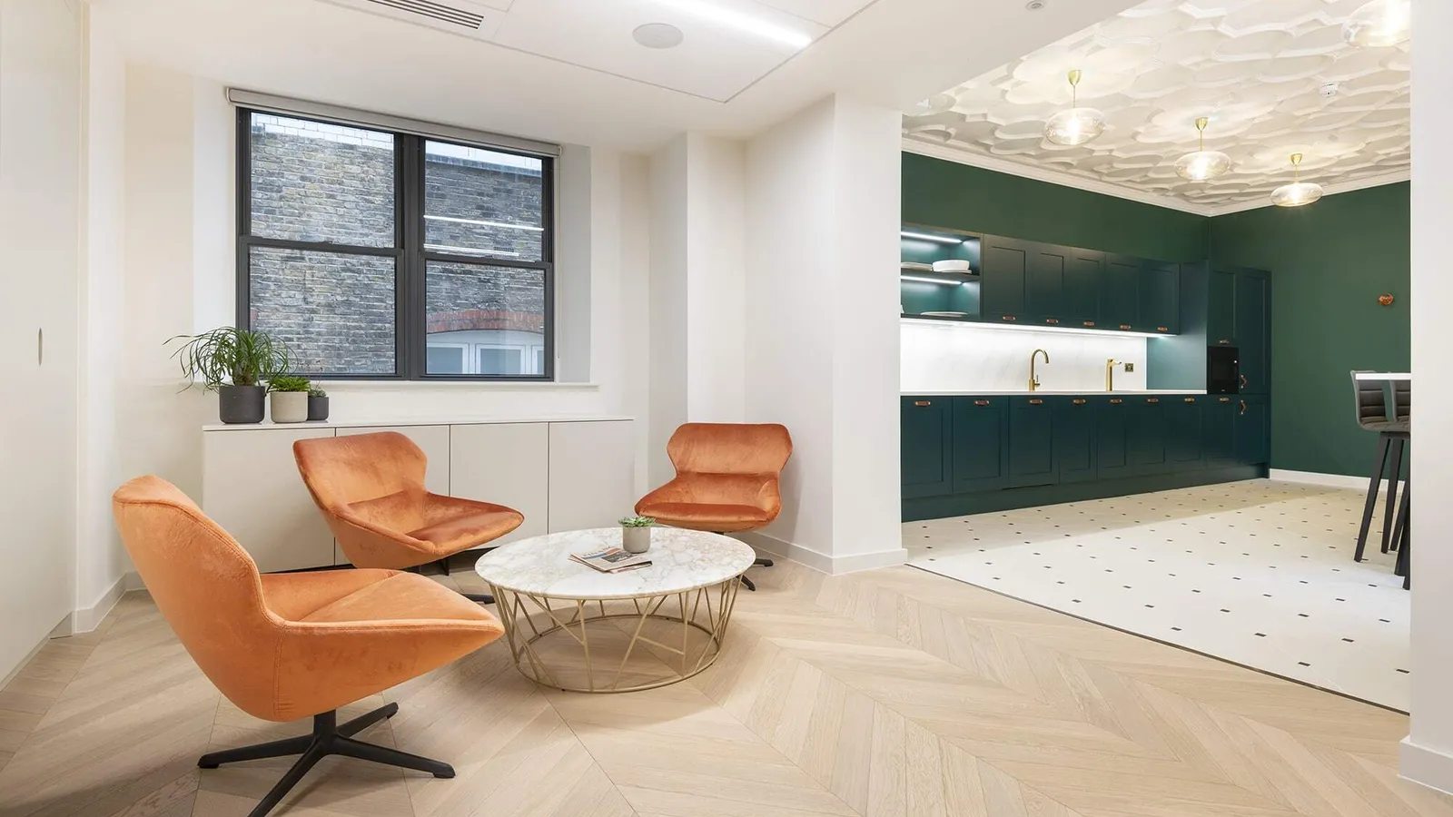
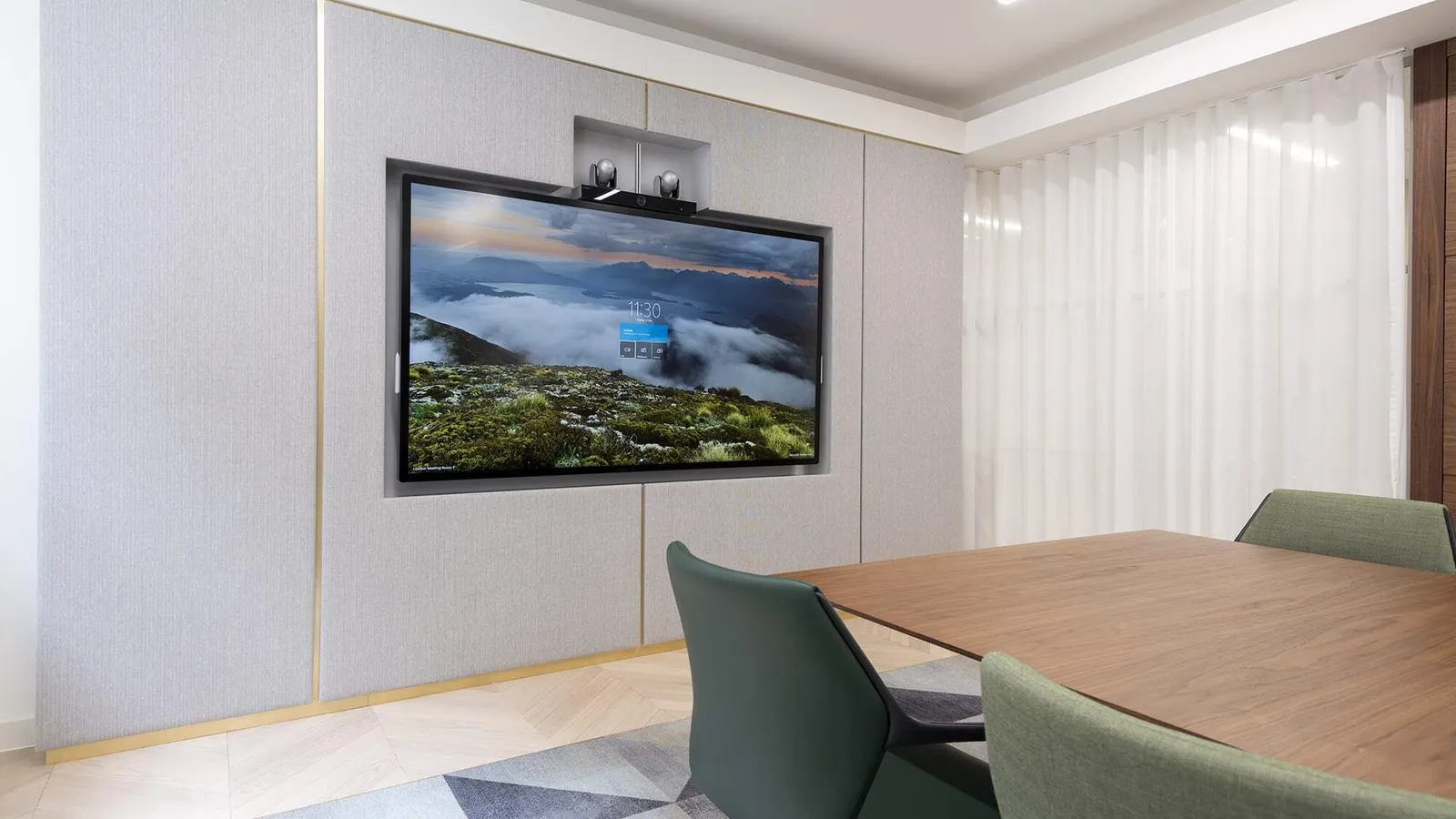
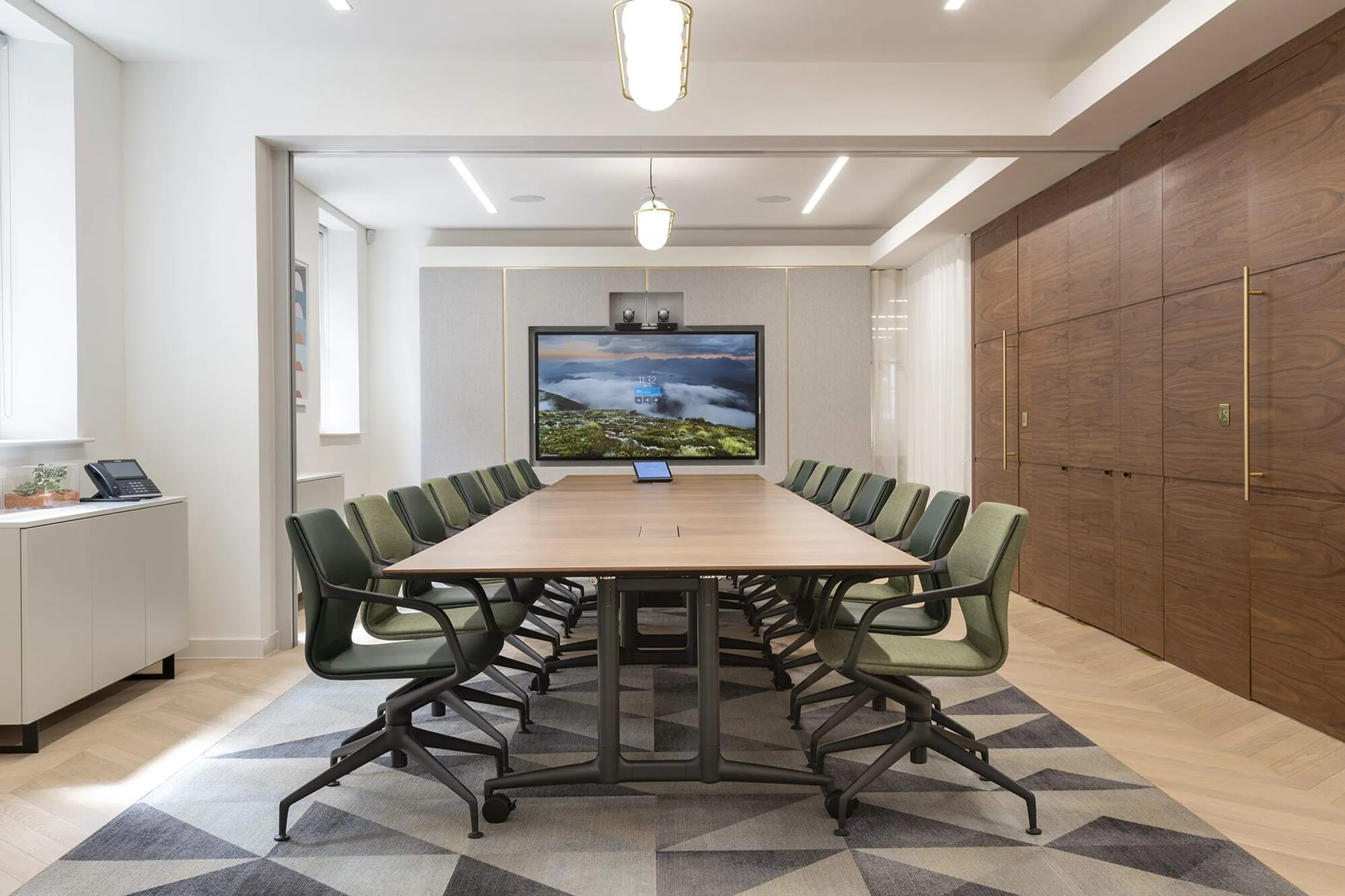
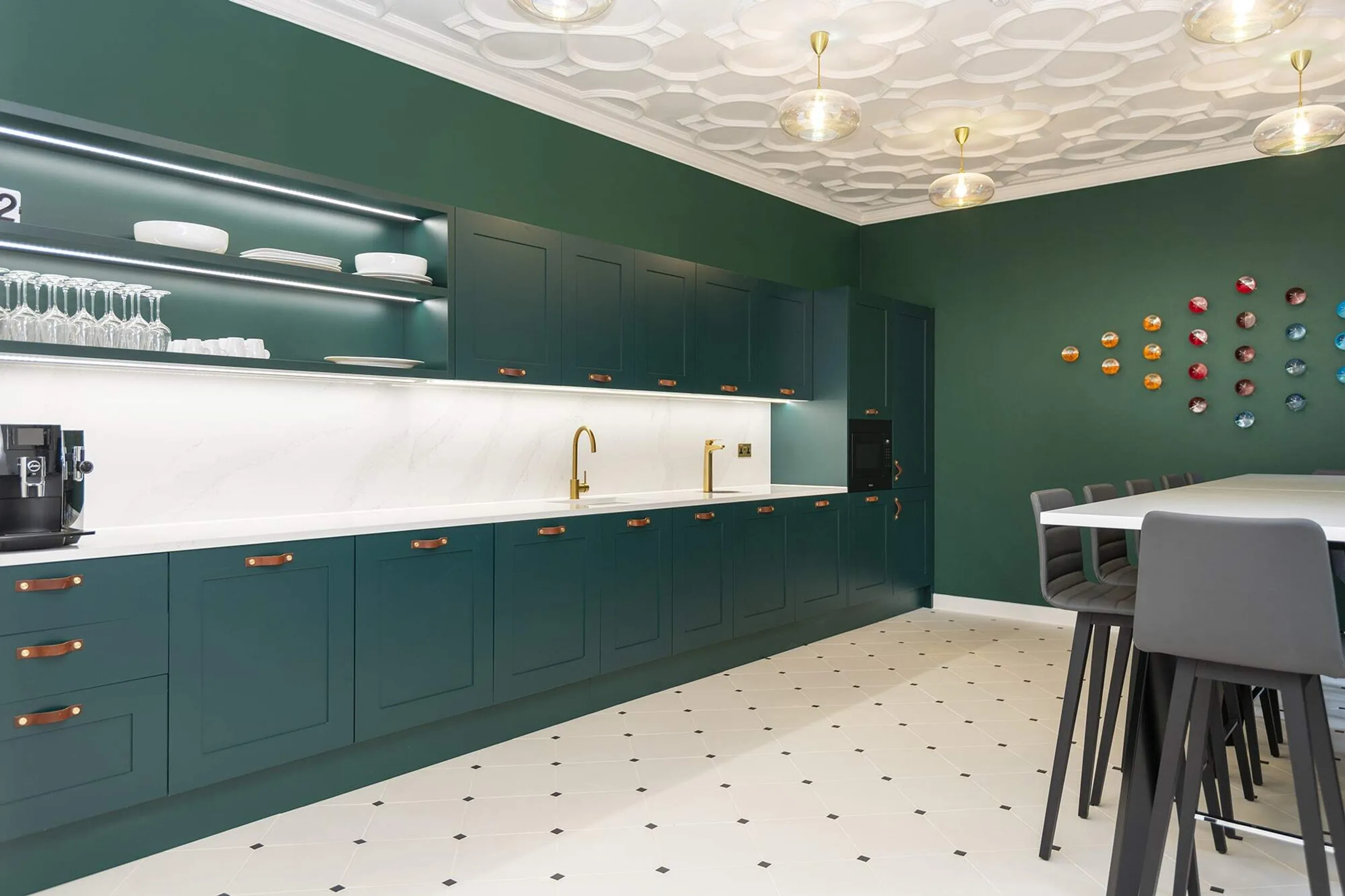
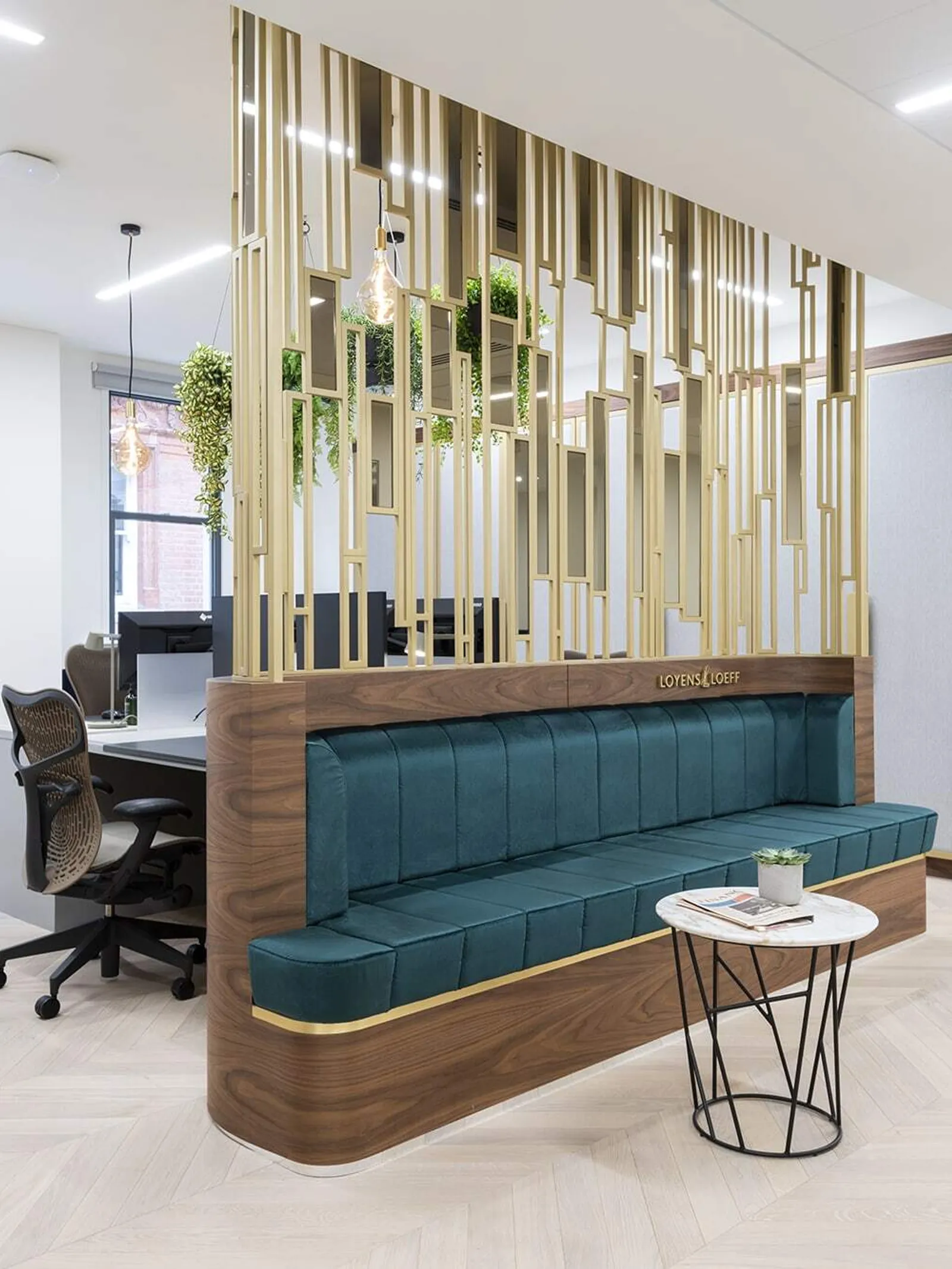
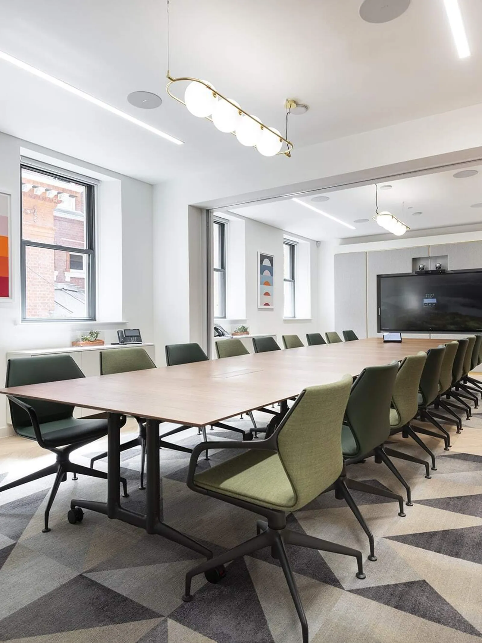
The kitchen, breakout area and boardroom have been designed with flexibility in mind, transitioning from everyday use to a multipurpose event space, maximising the footprint to suit any function. This space has been reimagined with a contemporary yet traditional aesthetic. Deep greens and burnished brass fixtures coupled with bespoke walnut joinery and restored ornate ceiling detailing – this space undeniably exudes quality and interest.
Project insight
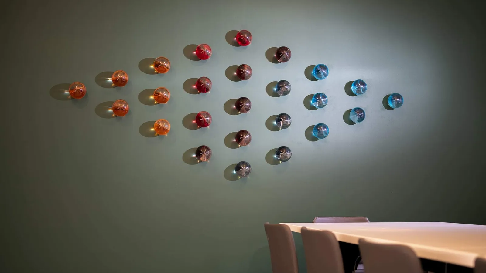
In collaboration with design studio Acrylicize and Loyens & Loeff, we co-created a series of artworks for the new office that celebrate and enhance the workplace, inspired by the integral ideology of putting people at the heart of the business. A theme of transparency and teamwork runs through each piece which celebrates the firm’s social and collaborative community across international borders.
The works are woven with connections to the firm’s four home markets –Belgium, The Netherlands, Luxembourg and Switzerland. Our favourite in the collection – ‘Migration’ – a visual depiction of the talented and individual employees as classic paper aeroplanes, representing communication both nationally and internationally. This piece also champions the connections between the Loyens & Loeff European hubs.
